Beginning HTML and CSS
Class 2
Welcome!
Girl Develop It is here to provide affordable and accessible programs to learn software through mentorship and hands-on instruction.
Some "rules"
- We are here for you!
- Every question is important
- Help each other
- Have fun
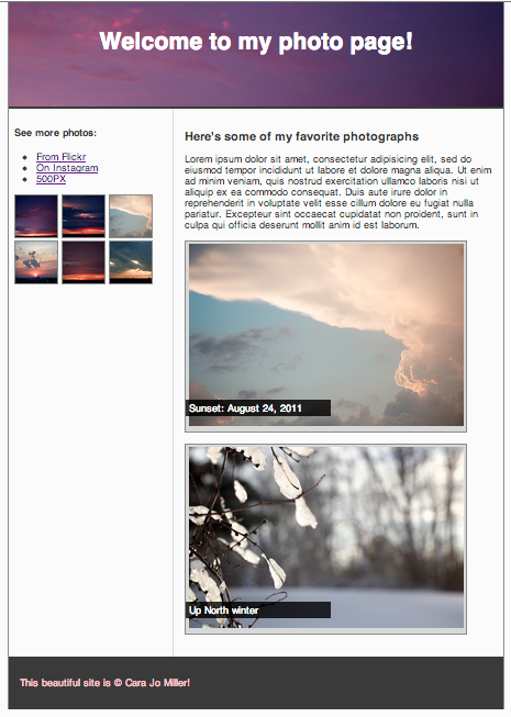
What we'll be making today
Today we will be making a site from scratch using divs and spans to create a header, footer, sidebar and a content area.
Inline vs Block
So far, we have mostly seen "block" elements
They appear on the next line, like paragraphs
There are also "inline" elements
They appear on the same line that they are written on.
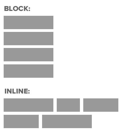
Block & Inline Elements
- CSS divides HTML into two types: inline and block.
- After block elements, browsers render a new line.
- Inline elements: img, a, br, em, strong
- Block elements: p, h1, ul, li, almost everything else
Element: Div
- Block level element. Each new div is rendered on a new line.
- A division, or section of content within an HTML page.
- Used to group elements to format them with CSS.
- Apply IDs and Classes to divs to control their styles with CSS.
<div>
   <p>Content<p>
   <p>Content<p>
</div>
<div id="header">
<h1>Main Heading<h1>
</div><div class="sub-content">
<p>Some more content<p>
</div>Grouping elements with div
- The div tag is used everywhere to group elements together into sections.
- For example, what if we want the first 2 paragraphs of a section to be right-aligned, purple & bold, but we don't want any other paragraphs to be right-aligned?
- We would wrap them in a div element to style them differently.
Grouping elements with div, cont.
.align-right{
  text-align:right;
  color: green;
  font-weight: bold;
}
<div class="align-right">
  <p>Lorem ipsum dolor sit amet, consectetur adipisicing elit</p>
  <p>Sed do eiusmod tempor incididunt ut labore et dolore.</p>
</div>
<p>Magna aliqua. Ut enim ad minim veniam.</p>
<p>Quis nostrud exercitation ullamco.</a>
Lorem ipsum dolor sit amet, consectetur adipisicing elit
Sed do eiusmod tempor incididunt ut labore et dolore.
Magna aliqua. Ut enim ad minim veniam.
Quis nostrud exercitation ullamco.
Let's Develop It
Let's create a site using divs to separate content into different sections on our page.
Create a header, content area, sidebar, and a footer.
Element: Span
- Inline element. Each new span is rendered next to each other & only wraps when it reaches the edge of the containing element.
- Can be used to apply styles to text inline so as not to break the flow of content.
Span
Span is used to apply a specific style inline
.yellow{
  color:yellow;
}
<p>Paragraph with <span class ="yellow">yellow</span> text.</p>
Paragraph with yellow text.
Let's Develop It
Let's add some spans to our content to help highlight some text.
Pseudo-classes, more CSS for links
Changing the format of a link when you hover over it is accomplished by using pseudo-classes.
CSS pseudo-classes are used to add special effects to some selectors.
selector:pseudo-class
{
  property:value;
}
a:link
{
  text-decoration: none;
}
Pseudo-classes, more CSS for links
  a:link	{color:#FF0000;} /* unvisited link */
  a:visited	{color:#00FF00;} /* visited link */
  a:hover	{color:#FF00FF;} /* mouse over link */
  a:active	{color:#0000FF;} /* selected link */
Note: a:hover MUST come after a:link and a:visited in the CSS definition in order to be effective!
Note: a:active MUST come after a:hover in the CSS definition in order to be effective!
Let's Develop It
Add pseudo classes to your links
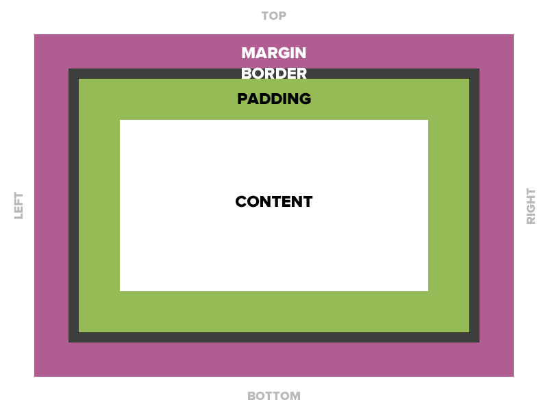
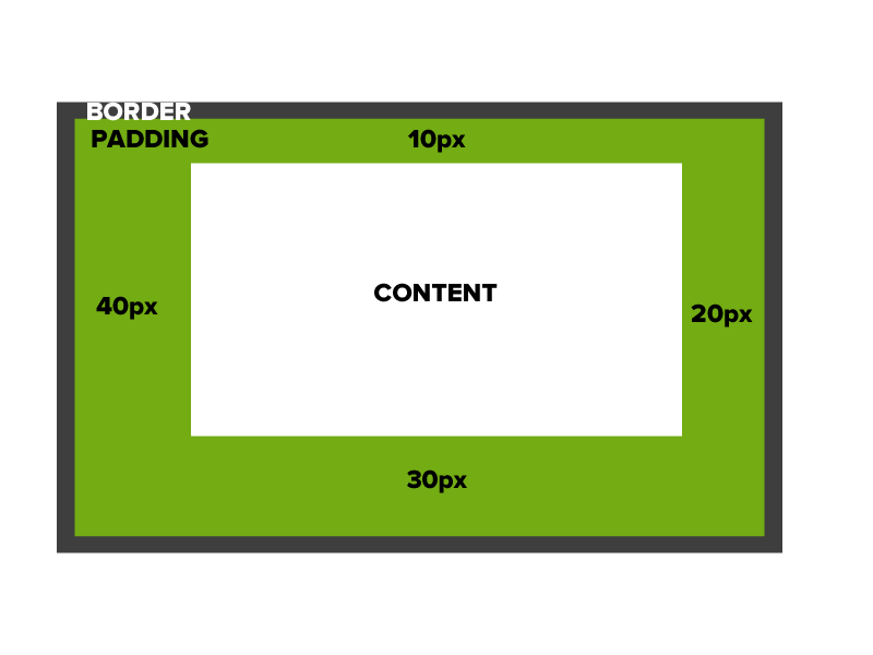
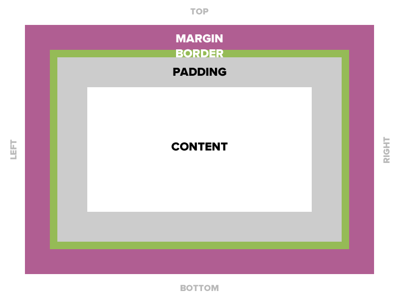
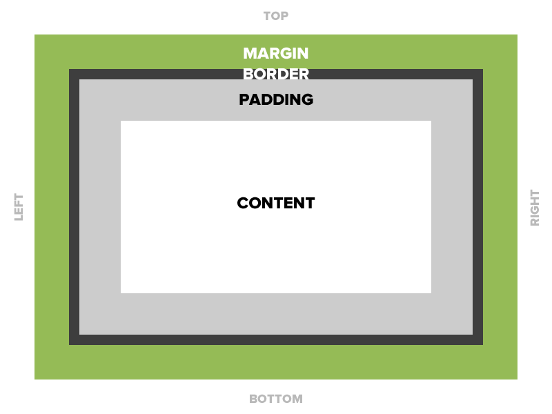
Box Model
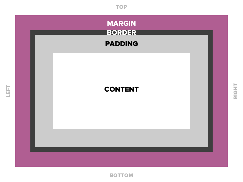
Padding
Space between the border and the content
Padding
Space between the border and the content
Adds to the total width of the box.
Padding
15 pixels on all sides
padding: 15px;
padding-top: 10px;
padding: 10px 5px 3px 5px;
Padding
Four values
padding: top right bottom left;
Two values
padding: top/bottom right/left;
One value
padding: all;
Padding
padding: 10px 20px 30px 40px;
Border
The edge around the box, specified as "thickness, style, color."
Border
A solid red border
border: 1px solid #ff0000;
A thick dotted black top border
border-top: 4px dotted #000000;
Two different border styles
  border-top: 1px solid #ff0000;
  border-bottom: 4px dotted #000000;
Border - Other Properties
  border-width: 10px;
  border-style: dashed;
  border-color: #666666;
You can specify each property separately, or all three together.
Margin
The transparent area around the box that separates it from other elements.
Margin
15 pixels on all sides
margin: 15px;
10 on top, 5 on right, 3 on bottom, 5 on left
margin: 10px 5px 3px 5px;
10 pixels on top
margin-top: 10px;
Auto Margin
If a margin is set to auto on a box that has width, it will take up as much space as possible.
CENTERED
  margin: auto;
  width: 300px;
FLUSH-RIGHT
  margin-left: auto;
  margin-right: 5px;
  width: 300px;
Let's Develop it!
Let's add some padding, borders, and margins to our divs.
Let's center our entire document in the browser.
Property: Width
Sets the width of an element.
Does not include padding or borders, remember these add to the width.
Property: Height
Sets the height of an element.
Does not include padding or borders, remember these add to the height.
Let's develop it!
Add a width & height to our divs.
Use IDs to target each div with CSS
Questions?
Positioning & Floats
Static Positioning
HTML elements are positioned static by default.
Static elements are positioned in the normal flow of the page.
Static elements ignore top, bottom, right or left property specifications.
Static Positioning
In normal flow, inline boxes flow from left to right, wrapping to next line when needed.
<img src="img/cookie1.png"/>
<img src="img/cookie2.png"/>
<img src="img/cookie3.png"/>
...
<img src="img/cookie2.png"/>
<img src="img/cookie3.png"/>


Static Positioning
In normal flow, block boxes flow from top to bottom, making a new line after every box.
 <p>Greetings</p>
 <p>Hello</p>
 <p>Hi there!</p>
Greetings
Hello
Hi there!
Relative Positioning
- Takes the element out of the normal flow, allowing it to be moved to the top, left, right or bottom.
- Does not affect the elements surrounding it.
- Makes an element a "positioning context" in which to position other elements relative to it.
- Relative positioning and absolute positioning are used together.
Relative Positioning
The "relative" value will still put the element in the normal flow, but then offset it according to top/left/right/bottom properties.
  .relative{
    position: relative;
    left: 80px;
    top: 20px;
    height: 100px;
    background-color: yellow;
  }
Absolute Positioning
- Positions element outside of the normal flow.
- An absolutely positioned element is offset from its container block, positioned relative.
- Its container block is the first element that has a position other than static.
- If no such element is found, the container block is <html>.
- Other elements act as if it's not there.
- Determined by its offset values in the properties top, bottom, right and left.
Absolute Positioning
The "absolute" value will take the element out of the normal flow and position it in relation to the window (or the closest non-static element).
  .top{
    position: absolute;
    top: -40px;
    right: 10px;
    background-color: yellow
  }
  .bottom{
    position: absolute;
    bottom: -40px;
    left:60px;
    background-color: green
  }
Example: Absolute Positioning
Here's an example of an image with a caption absolutely positioned over top of it.
The containing div has a position of relative, and the caption has a position of absolute.
Z-index
When you use positioning to move elements out of the normal flow of content, elements can overlap. You can change the order of overlapping with z-index.
The element with highest z-index goes on top.
  .bottom{
    position: absolute;
    bottom: 10px;
    left:60px;
    background-color: yellow;
  }
  .top{
    position: absolute;
    bottom: 15px;
    left:60px;
    background-color: green;
    z-index: 2;
  }
Let's Develop it!
Let's add some positioning.
Let's create a div that contains an image and a caption, and position the caption absolutely overtop the image.
Float
- "Floating" an element takes it in the normal flow, as far to the left or right of its containing element as possible.
- Any other elements, such as paragraphs or lists, will wrap around the floated element.
- Always specify a width when floating an element, otherwise the element is likely to take up the whole page and not appear floated.
- You can specify a) whether an element is floated or not, and b) which side it floats on.
Float: Example
Below a <blockquote> is floated to the left, allowing text to wrap around it on the right
Float
  .float{
    float:left;
    width:200px;
    background:yellow;
  }
I like to hang out on the left side.
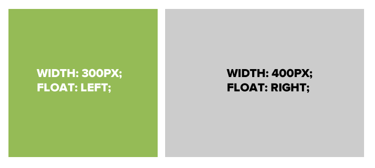
Using floats to place elements side by side
If you want two block level elements to be side by side, you need to float both elements. One left, and one right.
Clear
- Clearing tells the element on which side (right, left, both) other elements cannot appear.
- If you had an image floated left, and you did not want the paragraph to appear next to it, you would add clear: left; to the paragraph.
- Clearing both sides makes sure floats don’t flow past the clear element.
  clear: right;
  clear: left;
  clear: both;
Clear
   .float{
     float:left;
     width:50px;
     background:yellow;
   }
   .clear-left{
     clear:left
   }
hi
hi
Let's Develop It
Let's float our side bar and content areas.